The Dylan Chicago
Chicago, IL
- Design
- 2019-2021
- Construction
- Completed 2024
- Project Area
- 315,875 square feet
- Consultants
- Thornton Tomasetti, Structural; Salas O’Brien, MEPFP; Spaceco, Civil; Confluence, Landscape; Jenkins and Huntington, Vertical Transportation; Shiner, Acoustics
- Contractor
- Walsh Group / BOWA Construction
- Materials
- Vision Glass, Spandrel Glass, Metal Panel, Metal Clad Structure, Brick Masonry
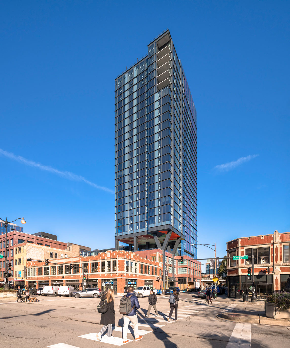
Located at 160 N Morgan Street, this 29-story multi-family development reinforces the vibrancy and character of its surrounding neighborhood while respecting the fundamental values of Chicago’s Fulton Market district. The design of the building accounts for a variety of unique contextual factors. It is situated across the street from the Morgan CTA station, 1 block from Google’s Midwest Headquarters and McDonald’s World Headquarters, and is surrounded by top restaurants, bars, shops, and entertainment venues.
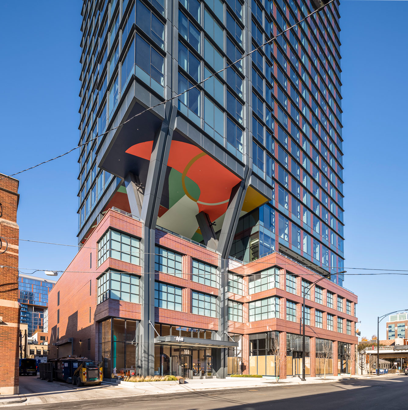
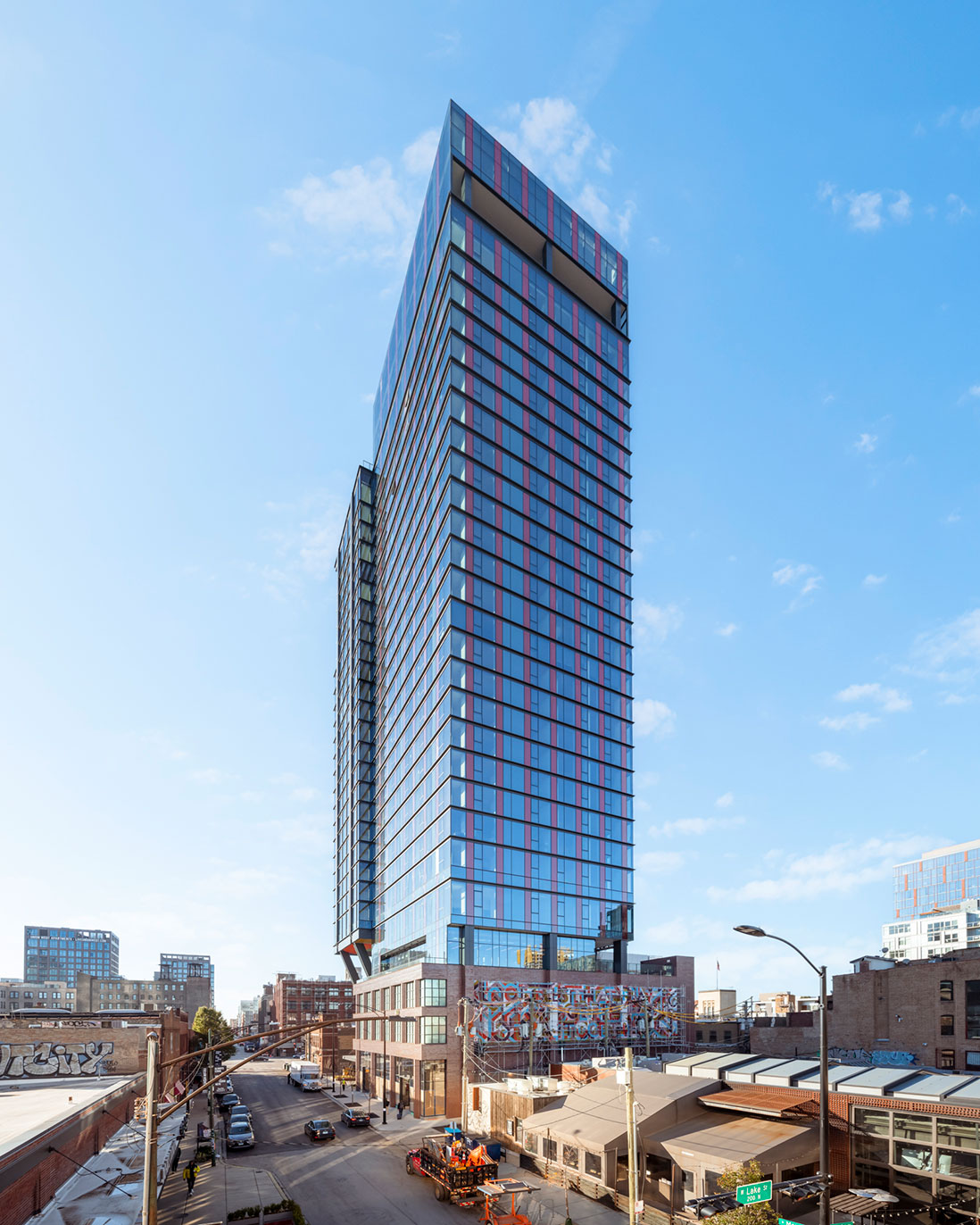
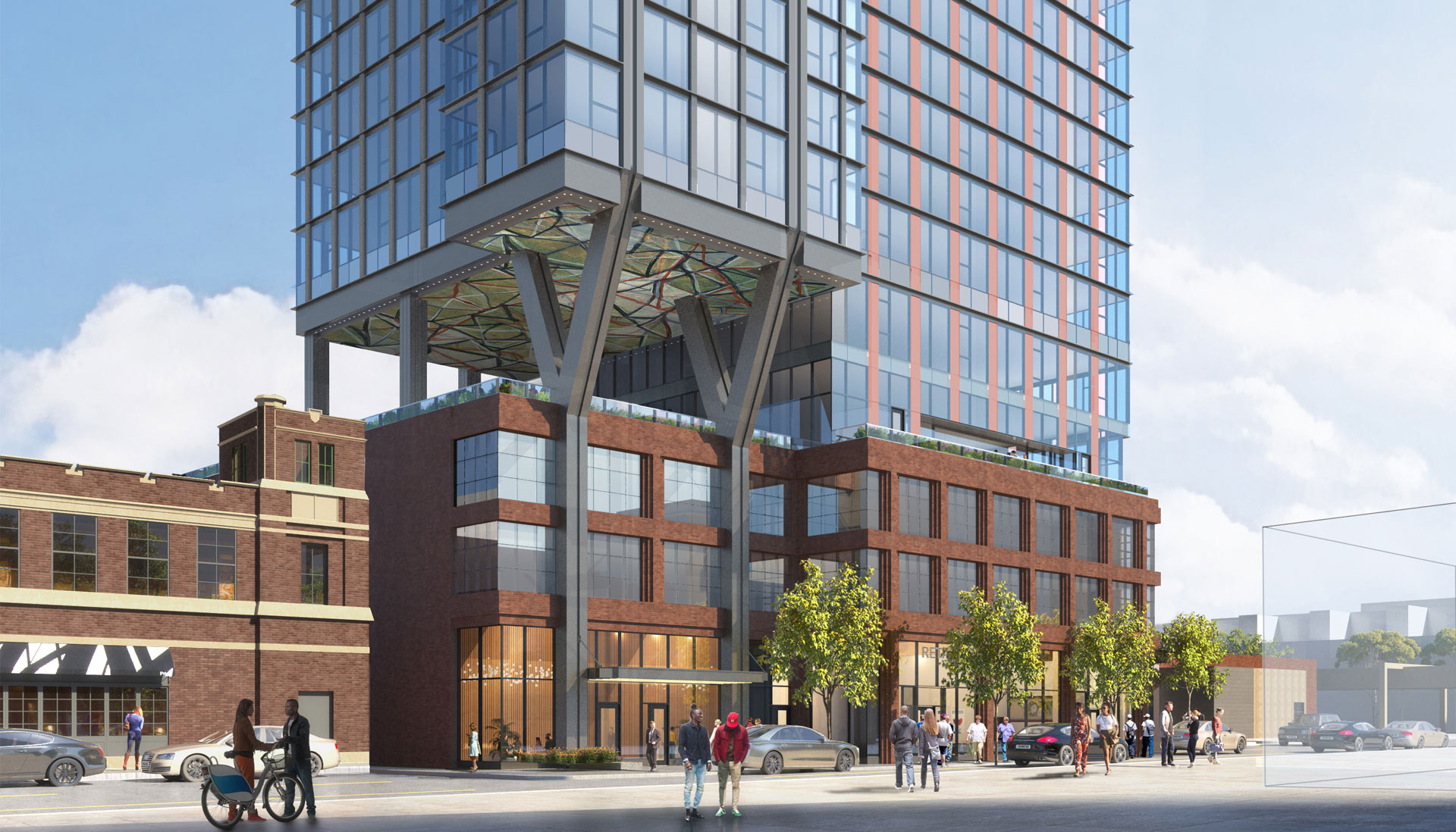
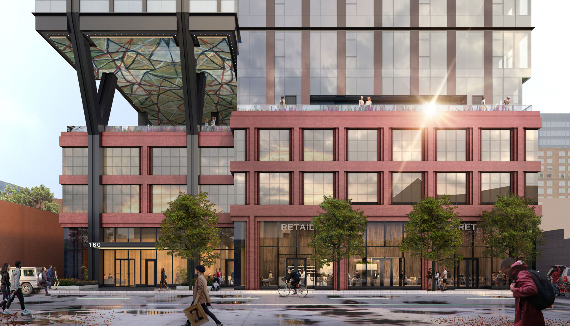
The materiality of the building consists of a high quality and modern palette that is rooted and inspired by the industrial brick and metal structures of the neighboring buildings and elevated CTA track. The brick masonry at the base of the building allows enhanced detailing creating depth at the pedestrian level. The primary cladding material of the tower is a rhythm of detailed metal and glass that provides visual contrast between light and shadow.
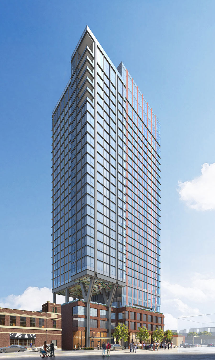
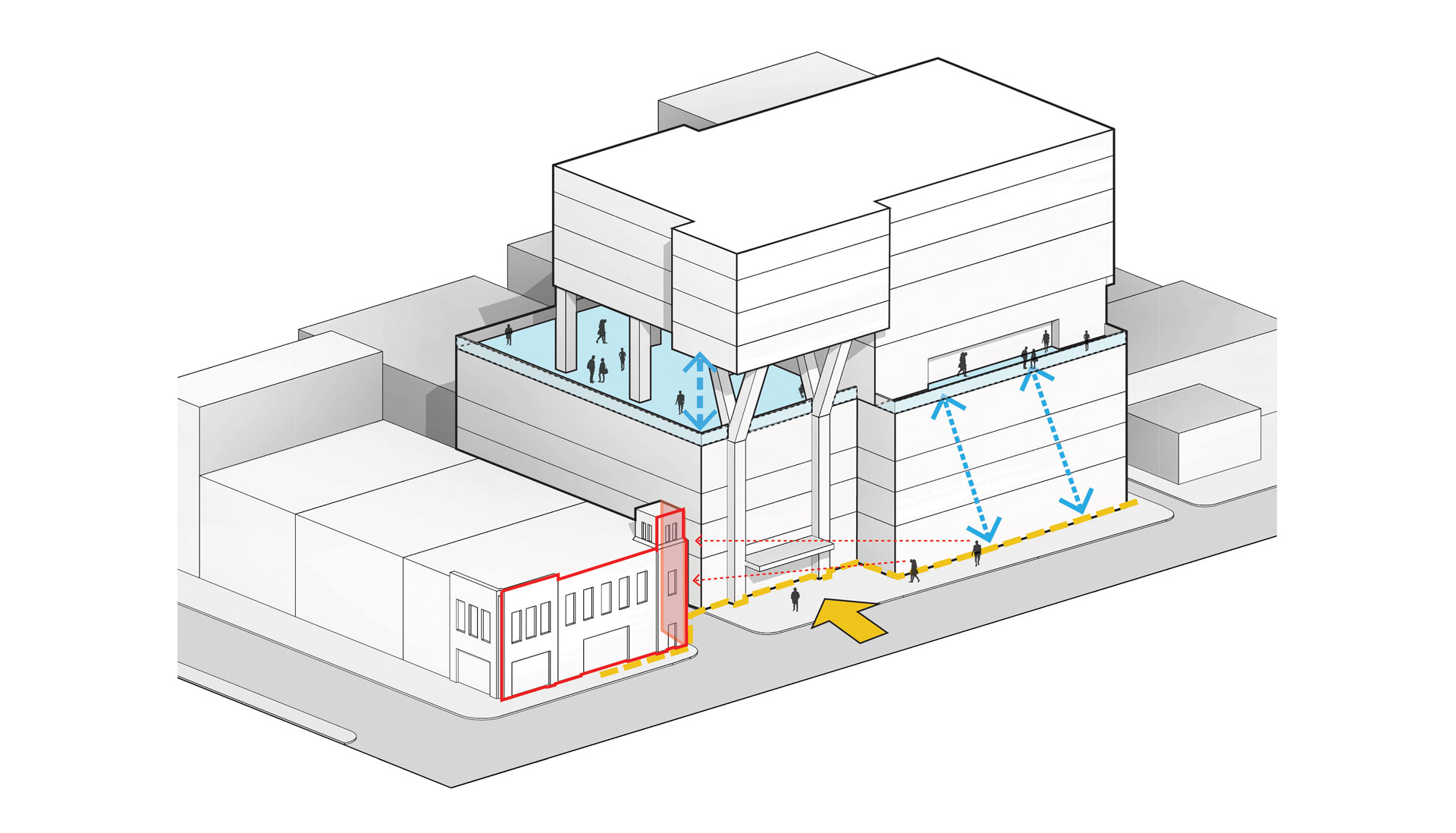
The massing of the building is comprised of a series of simple shifts, enhancing the vertically of the structure and providing visually pleasing proportions throughout. The brick masonry podium establishes a pedestal for the tower overhead, grounding the project in relation to the neighboring buildings. Active uses at ground-level include retail, the residential lobby, and access to the parking garage, overall enhancing the pedestrian experience of this block.
The middle portion of the building rests atop a set of columns extending from the podium. This formal separation of the tower allows for an indoor/outdoor amenity floor, as well as providing separation between the tower and the neighboring historic building to the south. This outdoor amenity deck features ceiling artwork that is purposefully visible to street level pedestrians.
The top of the building is responsive to the programmatic desire of the client to provide substantial outdoor space for the upper-level units. The tower recedes on the south and north to give the building a lighter presence and allow the integration of substantial outdoor space. The availability of large terraces allows the building to distinguish itself in the market and give the tower a noticeable presence in the skyline.
